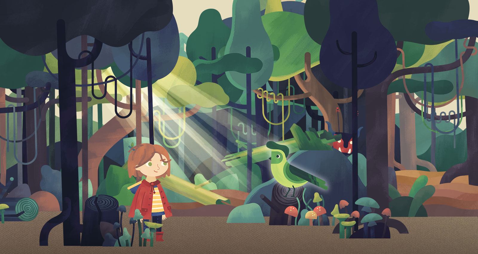
Tara’s Story – A children’s book brought to life in VR
We’ve spent the last eighteen months working towards the creation of a virtual reality (VR) experience for children, culminating in the release of Tara’s Locket. It’s been a fascinating journey and, despite all the hype around VR, it’s been one on which there are still very few signposts, especially when your audience is children.
Right back at the beginning, we had an idea that mobile VR, specifically Google’s Cardboard viewer, might be a medium on which the worlds of children’s books could be brought to life. The magic of a picture book is the way in which the illustrations create more than just a backdrop for the words. The pictures set the tone and mood, and often through incidental details, make the story feel deeper and the world more real. If a child could step into these worlds and explore, suddenly the opportunities for story and character development could genuinely support, rather than replace, the original book. Alongside the potential of VR, the Google Cardboard format itself seems perfect for this audience. It’s homespun, customisable, do-it-yourself ethos, isn’t so far removed from cereal-box spaceships and tinfoil robot costumes of childhood.
Suddenly the opportunities for story and character development could genuinely support, rather than replace, the original book.
Having reached the first major milestone on our journey, this is a (very shortened) account of what we’ve learned so far…
From page to world
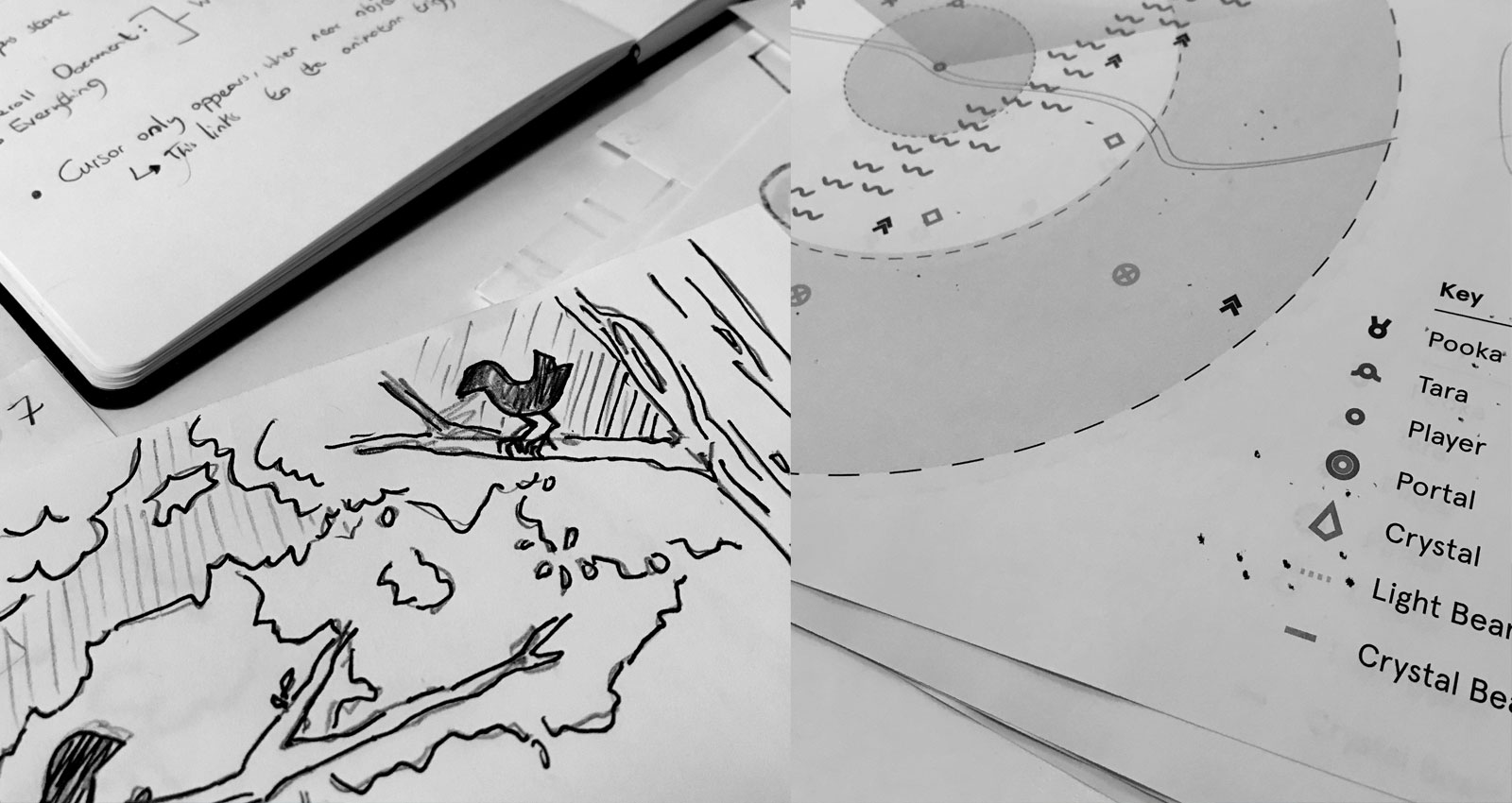
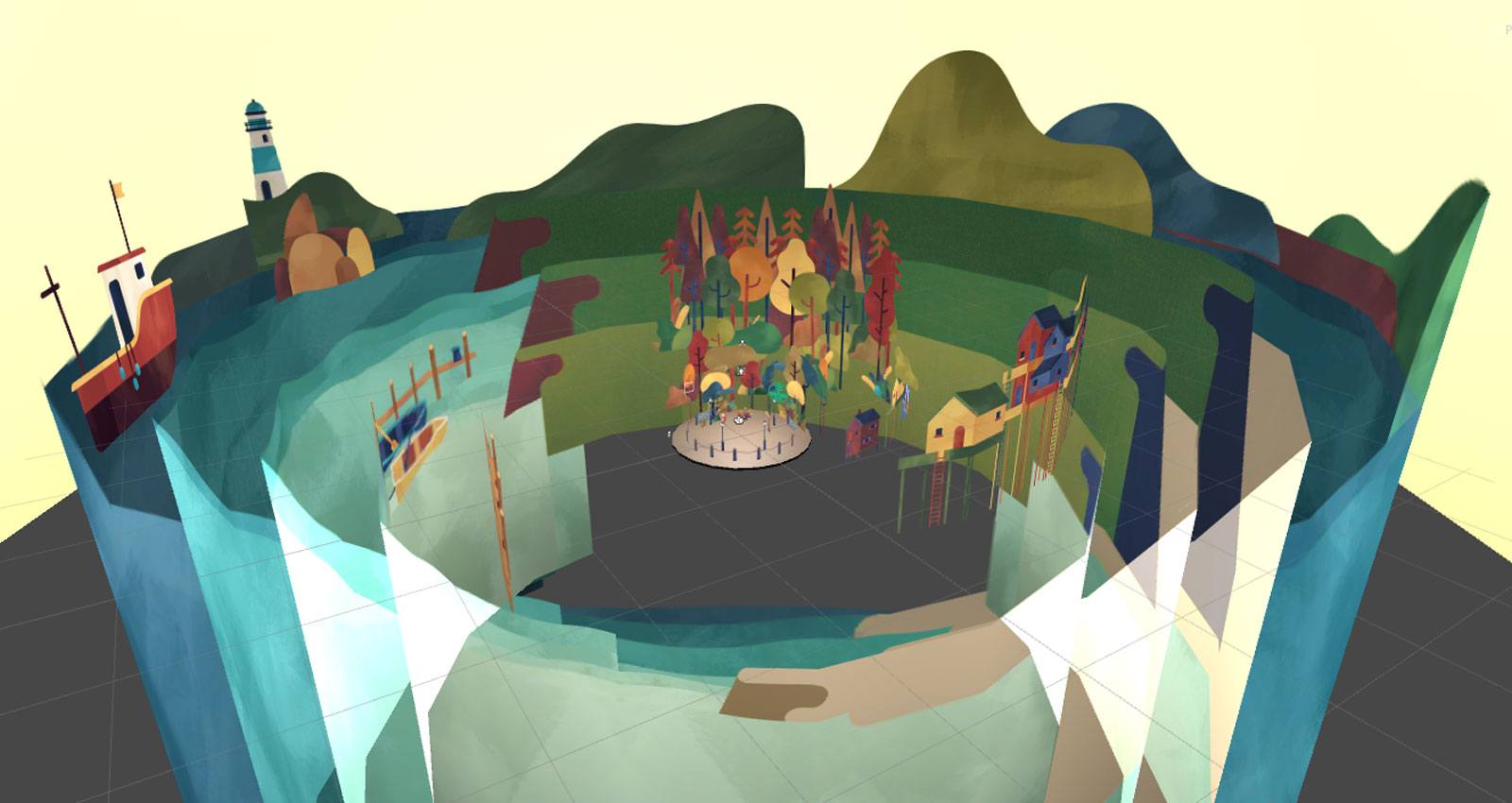
In our early discussions with publishers and authors of children’s books, it quickly became clear that they wanted more than just a simple retelling of an existing story. The opportunity to expand on the world, characters and themes in the story resonates most with creators. It’s also critical that the transition from page to virtual world in no way compromises the illustrations. Given the wide variety of styles and media used to illustrate picture books, we knew we needed to develop an approach that could accommodate this variation. Bringing a world bound by two dimensions to life as a completely immersive, three-dimensional environment is a real challenge, and, authors were very quick to tell us, must be handled in way that protects the integrity of the original artwork.
Our team settled on Unity as the best tool in which to create Tara’s story (it ships with base level VR capabilities as standard) and experimented with texture mapping, image projection and other modelling techniques to bring original artwork through to VR environments. Ultimately, the team combined many complex technical processes to achieve a successful end result, (including occlusion culling and optimisation of off-the-shelf drawcalls and tris), yet it was some of the simplest insights that made the most difference.
Firstly, it became clear that setting up the virtual environments so that the user could explore without requiring them to navigate through the virtual space, greatly simplified the whole user experience. Only high-end VR systems such as Vive map users’ spatial movement and location in the real world to that of the virtual world, so conventional Mobile VR experiences tend to use game-like controls to let users move around. This introduces a layer of complexity to the user experience (UX) which we were keen to avoid, and can also disorientate some users (“How come my eyes see that I’m moving but I know that I’m standing still?”). So we designed Tara’s world so that it could be explored simply by looking around and designed the interactions so that they’re triggered by the user’s ‘area of attention’.
“We designed Tara’s world so that it could be explored simply by looking around.”
Secondly, we doubled-down on optimising everything so that there’s little or no ‘lag’ in the visuals. Lag, in the context of VR, describes the gap between what the the user sees and where they are looking – when lag is bad, the visuals seem to stutter and can leave you feeling nauseous. A side benefit of focus on optimisation is a smaller app which downloads faster and eats up much less storage space. On phones already crowded with photos, videos, games, more photos, and some more photos, a lean app is more easily downloaded and less likely to be deleted.
A new way to tell stories
As we moved through early prototyping and testing it became increasingly clear that the narrative and storytelling conventions from books, films and even games, aren’t always successful in VR. Younger users in particular find it hard to resist the impulse to look around and explore the world into which they suddenly find themselves transported. There’s no guarantee that they’ll notice, or care, about a story playing out in one particular part of the scene. In addition to this we found that ‘lean back’ moments, during which there’s no means of interacting beyond simply spectating, feel really long in VR experiences. It seems that the passive attention spans of users young and old are even shorter when they’re in VR.
So, in Tara’s Locket, we’ve created environments in which the user can subtly move the story forward at their own pace and as a result of simple interactions. Connecting these interactions to the user’s exploration of the world then rewards them for the activity in which they’re already instinctively engaged. Further testing helped highlight and then balance out some usability issues by bringing through visual hints to draw the user toward the next interaction point.
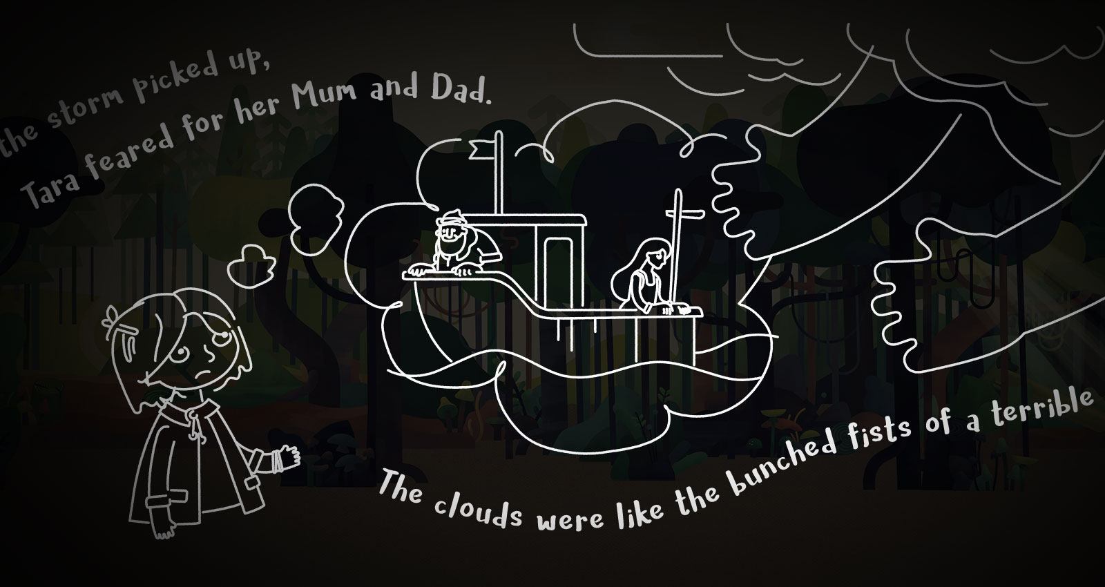
Changing the pace and nature of the VR environments also helps to provide room for narrative progression. We developed a series of interludes – almost like limbo spaces – between each main environment and, alongside providing an ‘orientation’ period, we found that these answer another thorny VR storytelling challenge; how to best use text in a VR experience.
The written word in picture books is, of course, a central component, and for younger readers its value lies in the opportunity it provides to become familiar with the shape and form of letters and words. Conscious also of the fact that our users want to interact and not just watch, we created the interludes around flowing sentences that reveal themselves as the user follows the text, and guides them to the conclusion. For users too young to read the words this ‘flowing sentence’ model is useful in reinforcing some very simple literacy fundamentals, such as reading from left to right. As a rule of thumb, VR is best when it relies on the least amount of text, but it can work to enhance the experience when used sparingly to change the pace and progress the narrative.
Making Tara’s Locket provided the Big Motive team with so many opportunities to learn as we delved into a completely new medium, along with the illustrator Priya Mistry, StoryFX and Scoredraw Music who partnered with us to bring to life the landscapes and characters of Urah (Tara’s island). The pick-up-and-play nature of mobile VR (Google Cardboard) turned out to be the right platform for the audience. It delivers the all important ‘wonder moment’, those few seconds of magic when you feel transported to a completely new place. It’s also just as easy to put down as it is to pick up, something that parents put high up on their list of priorities – ‘full’ VR with its trailing cables, strapped-on visors and headphones isn’t a good fit for busy families already concerned about the hours kids spend on screen time.
The storytelling potential for VR as a format has been the greatest point of validation for us though. Introducing a medium as new as VR to one as old as picture books brought with it no guarantee of success, but there is a natural, unforced connection. Almost more so than there is with the conventional extension of children’s books through games. Where games necessitate the prioritisation of challenge over story, VR can summon the world from the pages of a book allowing the story to unfold as the child sets off to explore.


